Published by: Architizer.com | Sydney Frankln | Sep. 1, 2017
Dating back to 1993, the Maastricht Academy of Art & Architecture is an exemplar of how the Dutch do glass-block buildings. While the near-14,000-square-foot facility is getting up there in age, to this day, it still sets the stage as inspiration for more modern uses of the diaphanous material. The design may have come out of the late 1980s, but its detailing and aesthetic is still relevant today — just as you’d hope for in a building that houses the study of iconic architecture and art. Read on for some compelling inspiration as you consider specifying glass block for your next project.
Sectional drawing by Wiel Arets
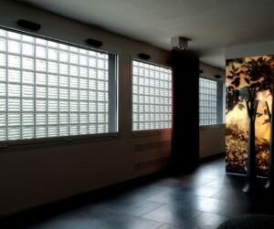
Designed by Wiel Arets Architects, the project contains a simple and refined material palette of traditional glass blocks and a concrete frame. According to the design team, this combination of limited building-products has allowed it to maintain its classic character and withstand the natural elements since its construction completion over 20 years ago.
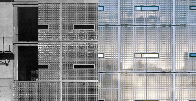
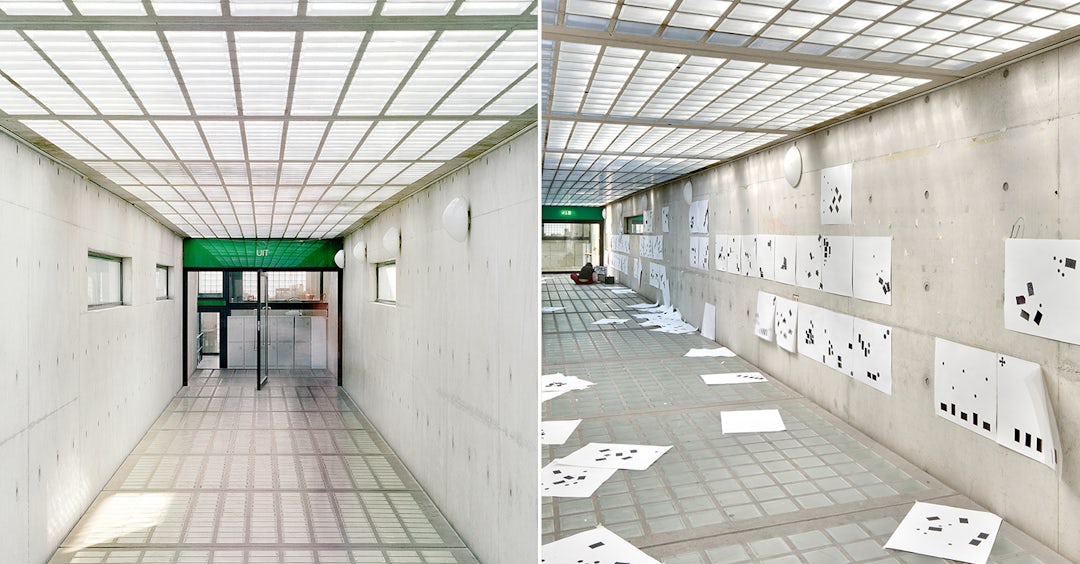
The project was originally built as an addition to the existing Rijkshogeschool in the small university town of Maasricht, the Netherlands. Many of the surrounding buildings that sit directly in the center of the city either evoked a medieval or industrial character, which compelled the architects to conceive the style as a cross between the two. Their research of the compact urban context resulted in a school comprised of two buildings that connect via an enclosed footbridge surrounded by mature trees. Its boxy bright exterior, including the elevated walkway, was draped in the sheer brick veil that both shields the students from city distractions as they study and provides them with dispersed daylight.
Section drawing showing the connecting footbridge by Wiel Arets
The footbridge includes glass blocks on both the ceiling and floor and can be used as an extraneous art space.
The introduction of glass blocks was a rather bold decision for Wiel Arets. Much of Maastricht was previously built up in sandstone construction unlike most brick-centric Dutch cities. The blocks served to bridge the gap between the lack of brick-laden façades throughout the city and the need for a more light-filled civic structure in a dense metropolitan zone.
“The building is very much about translucency,” said the architects. “The building was at first polarizing due to the glass block … but, since its completion, has been hailed as an instant classic by many critics.”
The glass block construction of the Academy is fairly straightforward compared to other groundbreaking designs using the same material. Nevertheless, Wiel Arets’ vision for a singular solid envelope — built during a time when this product wasn’t as widely used — makes this project a timeless precedent for specifying architecture firms today.
Up until the Academy was complete, it wasn’t clear that massive glass-block constructions were feasible from a structural perspective. Wiel Arets used hollow bricks, braced by a slender metal mesh, to carry the load of the various façade patterns. The end result is what looks like a series of small, stacked glass blocks enclosed within larger boxes made of concrete frames. Thin horizontal windows were inserted into each box taking up the building’s three stories, allowing for ventilation as well as undistorted views of the city.
Designed as an artists’ work-space, the Academy provides a sheltered atmosphere for users to concentrate on their own creative projects. The building’s motif was dreamt up as a space where people had room to freely think and stay stimulated by the local contrasting scenery.
“The glass block cocoons students and professors from city life while simultaneously affording them direct access to it,” said Wiel Arets. “The palette allows this addition to the existing academy building to seamlessly slip into this city of 120,000 while simultaneously creating a new urban square.” It turns out that, even at 24 years of age, Wiel Arets’ specification of glass block looks as good a decision today.
Photos by Jan Bitter via Wiel Arets unless otherwise stated. Header image by Kim Zwarts (left) and Helene Binet (right)






Give us a follow!